


Alt text for charts is a short, purposeful description that helps people understand a chart when they cannot see it. It matters for accessibility because screen readers rely on text alternatives to communicate what an image contains and, more importantly, what it means. The goal is not to recite every value, but to convey the chart’s message in the reader’s context, including the chart title, what is being measured, and the key takeaway. In this guide, you’ll learn a simple formula you can reuse, see examples for common chart types, and understand when a chart needs more than alt text, such as a longer description or a data table.
Best for: Simple charts where one main pattern or comparison can be stated clearly in one or two sentences.
Not ideal when: The chart has many series, dense labels, or requires reading exact values to understand the conclusion.
Good first step if: You can explain the chart’s purpose, the axes and units, and the main takeaway without listing every point.
Call a pro if: The chart is part of a compliance-sensitive document or an interactive tool that needs robust accessible design.
Quick Summary
- Alt text should communicate the chart’s purpose and message, not a full transcript of every data point.
- Include chart type, what is measured on the x-axis and y-axis, and the most important trend, pattern, or comparison.
- Mention units, date range, and data series names when they change the meaning of the chart.
- For complex visuals, combine alt text with a longer description, such as adjacent text or a data table.
- Use tool features like an accessibility checker, but treat automatic alt text as a draft to revise.
What Alt Text for Charts is (and When You Need It)
Alt text for charts is a text alternative that communicates a chart’s meaning to people who can’t access the visual. It is typically written in an HTML alt attribute or a document tool’s alt text field so assistive technology can announce it.
Add alt text when a chart appears as an image in a web page, slides, PDF, or document and the information isn’t fully stated nearby. If surrounding text already gives the takeaway, keep alt text shorter and identify the chart’s role. Decorative charts should be marked decorative, but most charts are informational. It also helps asset reuse in writing guides and standards.
The 1–2 Sentence Formula for Chart Alt Text
Strong chart alt text uses one or two sentences to identify the chart and summarize the intended insight. Use this structure: chart type + what’s measured (axis titles, units) + the key takeaway (trend, comparison, standout) as outlined in how to write alt text.
Before writing, confirm the chart’s purpose in the document. Include only details that change interpretation, like date range, percent vs absolute, axis scale quirks, and what each series represents. Put footnote nuance or source limitations in nearby text or a longer description, not in overloaded alt text.
Auto-generated alt text is a draft; revise for accuracy. Repeatable workflows, like step-by-step tutorials, improve consistency.
Include Chart Type + What’s Being Measured + the Key Takeaway
A strong one-sentence pattern is: “Bar chart of X by Y; the main result is Z.” Name the chart type (bar chart, line chart, scatterplot, flow chart), then state what the x-axis and y-axis represent, including units and the date range for a time series. Finally, summarize the key takeaway: the largest category, the steepest increase, a plateau, a gap between groups, or a clear comparison between series.
If the chart title or chart subtitle already expresses the point, you can echo it briefly to preserve intent. For example, instead of listing categories, you might say the top and bottom categories and what they imply. This approach also works for accessibility image alt text for graphs and charts used in reports where the narrative depends on the trend.
Avoid Common Pitfalls (Redundant Labels, “Image Of,” Visual-only Wording)
Avoid filler like “image of” or “graph showing,” since screen readers already announce the object type. Don’t repeat nearby text, such as a caption that states the same takeaway.
Don’t rely on visual-only references like “the red line” unless you name the series from the legend. Skip dumping every axis tick or slice percentage; it creates noise without meaning. Watch for ambiguity from missing units, unclear scales (especially truncated y-axes), or unlabeled categories. If understanding depends on exact values, add a data table or longer description instead of stretching alt text for decorative images beyond its role.
Examples of Alt Text for Common Chart Types
Effective examples show how to summarize trends, patterns, and comparisons while staying concise. Use these as templates, then adjust for your chart title, axis titles, units, and intended takeaway. In most cases, your alt text should not be a full data export; it should match the message your audience needs to carry forward.
When you write examples, include only the categories and series that matter to the conclusion. If the chart includes notes, footnotes, or a source citation that changes interpretation, place that context in the caption or adjacent text instead of bloating the alt text field. This is especially important when charts are embedded in a broader article or knowledge base page like helpful resources library, where readers may encounter the chart out of its original layout.
Bar and Stacked Bar Charts
For a bar chart, focus on the biggest comparison and any notable outliers. Example alt text: “Bar chart of support tickets by category (count); billing is highest, followed by login issues, while feature requests are lowest.” If the x-axis categories are many, name only the most important few and summarize the rest as “other categories are similar.”
For stacked bars, specify what the stacks represent (the legend) and summarize composition changes. Example: “Stacked bar chart of monthly sales by region (USD); total sales rise across the period, with the West region contributing the largest share each month.” If the key point is a shift in share, state that directly rather than narrating colors.
Line Charts, Scatterplots, and Multi-series Charts
For a line chart, include the time series context. Example: “Line chart of daily active users from May to July; usage climbs through June, then levels off in July.” If multiple lines appear, name each data series and the most important comparison: “Mobile grows faster than desktop and ends the period higher.”
For a scatterplot, explain what each axis measures and the relationship. Example: “Scatterplot of page load time (seconds) vs conversion rate (percent); higher load times generally correspond to lower conversion, with a few fast-loading pages converting above the rest.” When a multi-series chart includes many lines, give a group-level summary and call out only the most divergent series; otherwise, provide a longer description or a data table.
Handling Complex Charts: Pair Alt Text With a Longer Description
For complex charts, use alt text to identify the visual and state the main message, then point to a longer description for alt text examples. Charts with many categories, multiple panels, dense annotations, or value-by-value reading can’t fit in two sentences without becoming unclear.
Write alt text with chart type, scope, and takeaway, and tell readers where the full description or data lives. This approach fits dashboards, research figures, and interactive charts, where navigation and focus order also affect accessibility. Treat the long description as a companion so you don’t omit units, legend definitions, or notes.
Options: Caption/adjacent Text, Data Table, or Linked Long Description
Use a caption or adjacent prose to explain the chart and highlight key values. Provide a data table when readers need exact numbers or want to reuse the data. For web pages, add a linked long description or an associated text block that is programmatically discoverable.
Whatever method you choose, standardize where detailed descriptions live so they’re easy to update, similar to how teams centralize posts on a main blog hub.
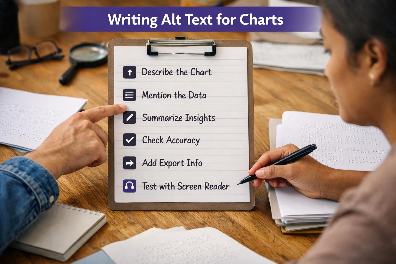
Quick Checklist and QA (Character Length, Context, Consistency)
Good chart alt text should let someone understand what the chart covers and what to conclude. Keep it brief but complete, usually one or two sentences. If you’re cramming in values, switch to a longer description.
QA before shipping:
- Identify chart type and topic.
- Name x- and y-axis measures; include units or scale when it affects meaning.
- Give date range and interval for time series.
- Define legend items; don’t rely on color.
- State the key takeaway (trend or comparison), not every label.
- Match surrounding context, captions, footnotes, and source notes.
For consistency, set a house style for percentages, currency, and ranges, and spot-check with a screen reader flow.
How to Add Alt Text in Common Tools (Google Sheets, Microsoft Office, Design Tools)
Most tools add chart alt text through a format or accessibility pane, but confirm which field assistive tech actually reads. In Google Sheets, insert the chart, open chart options, and add a concise description in the chart’s description/accessibility field before embedding or exporting, similar to using a WordPress alt text generator.

In Microsoft 365, charts often have an alt text title and description. Put the 1–2 sentence summary in Description; use Title only if your team standard requires it. The Accessibility Checker flags missing alt text, not accuracy.
In design tools, exports may drop alt text. Add final alt text in the CMS, document, or slides where the image is published.
Conclusion
Writing alt text for charts comes down to clarity: name the chart, describe what’s being measured, and state the key takeaway the reader should remember. Keep it brief, avoid visual-only language, and include the minimum axis, units, legend, and date range details that make the insight truthful. When a chart is too dense to summarize without losing meaning, pair the alt text with a longer description or data table so users can access both the message and the details of optimizing filenames, alt text, and size. With a consistent formula and a quick QA pass, alt text for charts becomes a repeatable part of accessible communication.