


If you’ve ever wondered how to write alt text that helps both real people and search engines, you’re in the right place. Alt text is short, purposeful writing that stands in for an image when someone can’t see it or when the image fails to load. In this guide, you’ll learn a simple formula, when to skip alt text entirely, and how to handle tricky cases like charts, logos, and linked buttons. You’ll also see clear good vs. bad examples you can copy and adapt.
Best for: Writers and site owners adding accessible, descriptive alternative text to blog posts, product pages, and resource libraries.
Not ideal when: The image is purely decorative, redundant with nearby text, or used as a CSS background image with no content value.
Good first step if: You can summarize what the image contributes to the page in one plain sentence without repeating the caption.
Call a pro if: Images control critical navigation, required forms, or complex information like maps, diagrams, or compliance-sensitive content.
Quick Summary
- Alt text lives in the alt attribute (alt=””) and should communicate the image’s meaning, not its pixels.
- Write for a screen reader first: clarity, context, and readable punctuation matter.
- Use empty alt (alt=””) for decorative images so users are not forced through noise.
- Functional images (links, image buttons) need alt text that states the action or destination.
- For complex images, summarize the takeaway in alt text and provide a longer text alternative nearby.
What Alt Text is (and Why it Matters for Accessibility + SEO)
Alt text is the written alternative in the HTML alt attribute (alt=””) that conveys an image’s purpose when it can’t be seen. It helps screen reader users understand content and complete tasks without missing information. It also helps search engines interpret what an image represents and how it relates to the page, especially when descriptions are specific and natural.
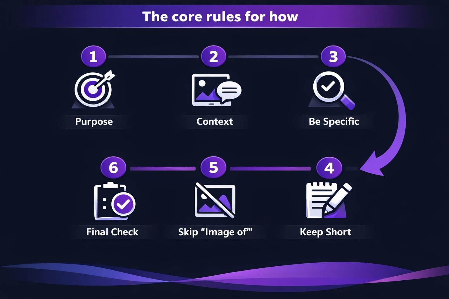
The Core Rules for How to Write Alt Text
Write alt text that is specific, contextual, and concise. Ask what the image contributes on this page and what a reader would miss without it. Describe only what supports that purpose, using natural language and simple punctuation for smooth screen reader output. Keep standards consistent with a team writing guides.
Describe the Image in Context (Not Every Detail)
Alt text should capture the point of the image as it relates to the page, not an exhaustive inventory of objects. If the image supports an instruction, describe the step result; if it supports a claim, describe the evidence shown. Include demographic information (age, gender, disability, race) only when it’s truly relevant to the meaning or task.
Keep it Short and Skip “Image Of…”
Alt text should be brief enough to scan and listen to, usually one sentence or a tight phrase. Screen readers already announce that an element is an image, so “image of” and “picture of” create redundancy in terms of how alt text can help SEO. Use straightforward punctuation and avoid stuffing keywords; readability beats repetition.
When to Write Alt Text Vs. Use Empty Alt (Decorative/redundant Images)
Write alt text when an image adds information, supports understanding, or enables an action. Use empty alt (alt=””) when the image is decorative or repeats nearby text. Decorative images include flourishes, dividers, and textures with no meaning. Redundant images include photos fully explained by a caption or icons paired with the same button words. For linked images and image buttons, describe the function or destination (for example, “Search” or “Download template”), not the artwork. Keep tool-specific steps in your tutorials library for consistency.
How to Write Alt Text for Different Image Types
Different image types call for different emphasis: identify, summarize, or instruct based on what the user needs to do. For a straightforward photo, describe the subject and the relevant action or setting. For functional images, describe the action. For complex images, give the key takeaway and provide a longer text alternative nearby (in surrounding text, a figure element with a figcaption, or a linked long description about alt text for logos) so users can access the full detail without cramming it into one alt attribute.
People, Products, and Logos
For people or products, name what matters: who or what it is, plus the relevant context (doing what, used for what, showing which feature). Avoid guessing identities or sensitive traits unless the page requires it. For a logo, alt text typically names the brand or organization; if the logo is a linked image to the homepage, the alt can reflect the destination, such as ‘Company name home,’ following accessibility image alt text guidelines.
Charts, Diagrams, and Other Complex Images
For a chart, graph, flowchart, or diagram, alt text should state the main insight, not every data point. Then provide the details in text near the image, or include a structured table if that’s the most usable format. For image maps or multi-part visuals, make sure each clickable region has an accurate text alternative that matches its target.
Alt Text Examples (Good Vs. Bad)
Good alt text fills the gap; bad alt text adds noise or misses the point, as seen in our alt text examples.
- Bad: “image of marketing dashboard.”
- Good: “Line graph showing steady month-to-month increase in newsletter signups.”
- Bad: “red shoes, red shoes, buy red shoes.”
- Good: “Red running shoes with reflective heel tab and textured sole.”
- Bad: “Company logo.”
- Good: “Aomark,” or “Aomark home” if linked.
- Bad: “Download” on a submit button.
- Good: “Submit contact form.”
Collect more examples in blog resources.

Common Alt Text Mistakes to Avoid
Avoid redundancy, vagueness, and mismatched function. Don’t repeat captions or headings verbatim; add only what the image contributes. Don’t over-describe irrelevant details unless they change meaning. Don’t stuff keywords; write accurate, natural descriptions. Don’t trust automatic alt text or AI captions without review; they often miss context or misread charts. Use an Accessibility Checker (for example in Microsoft 365) to find missing alt, then edit manually.
Quick Checklist You Can Use Before Publishing
Use this checklist before publishing.
- Purpose: Does it explain why the image is on the page?
- Context: Does it fit nearby text and avoid repeating a caption?
- Function: For linked images or buttons, does it name the action/destination?
- Conciseness: Is it a short phrase without “image of”?
- Clarity: Would it work read aloud by a screen reader?
- Complexity: For charts, include the takeaway and a longer description nearby.
- Decoration: If meaningless, use empty alt (alt=””).
Add this to content writing workflow notes.
Conclusion
To get better at how to write alt text, focus on intent: what the image adds, what a screen reader user needs, and what can be skipped as decorative. Keep descriptions concise, avoid redundancy, and write functional alt text for linked images and buttons to enhance your WordPress image SEO. When images are complex, pair a brief takeaway in alt with a longer text alternative so everyone can access the full information, not just the visuals.