


Alt text is one of those small details that quietly improves both usability and visibility, but only when it is written with purpose. In this guide, you will find practical alt text examples you can copy, adapt, and troubleshoot across common image types, from product photos to icons and charts. You will learn what the alt attribute (alt=””) is meant to communicate, how screen readers actually use alternative text, and how to keep descriptions helpful without turning them into keyword stuffing. We will also cover special cases like decorative images and images that contain text, plus quick templates you can use to write consistent, clear image descriptions in a content management workflow.
Best for: Site owners, writers, and designers who need clear, consistent alternative text that works for accessibility and image SEO.
Not ideal when: The image is purely decorative or repeats nearby text, where adding detail would create noise for screen readers.
Good first step if: You can identify the image’s purpose on the page and describe only what a user needs to understand or do.
Call a pro if: Critical user flows depend on images, or you need an accessibility audit across many templates, PDFs, and legacy content.
Quick Summary
- Alt text lives in the alt attribute and should express the image’s purpose in the webpage context.
- Strong alt text is specific and concise, not a caption, file name, or string of keywords.
- Functional images (icons, linked images, button icons) need action-oriented descriptions, not visual details.
- Decorative images usually should be skipped using empty alt (alt=””) to reduce screen reader clutter.
- Charts and data visualization need a short summary plus a nearby long description, not a wall of values.
What Alt Text is (and Why it Matters)
Alt text (alternative text) is the description in an image’s alt attribute (alt=””) that communicates the image when it can’t be seen. Screen readers announce it, and browsers may show it if the image fails to load, making it central to accessibility. It also supports image SEO because search engines use it to interpret an image’s role on the page, as outlined in the Accessibility Image Alt Text Guidelines.
“Alt,” “ALT text,” and “alternative text” mean the same thing. Strong alt is driven by page intent, not raw visuals. For more patterns, see the writing tutorials library.
Accessibility Vs. SEO—how to Balance Both
Accessibility should set the standard: describe what a non-visual user needs to understand or do, then let SEO benefit naturally. If the image is informative, write what it shows and why it matters; if it is functional, describe the action it triggers. If a relevant keyword fits naturally, it is fine, but clarity beats optimization. Also avoid repeating nearby headings or captions, since redundant alt text wastes time for screen reader users and does not help SEO.
A Simple Alt Text Formula You Can Follow
Use a simple pattern: name the subject, add one distinguishing detail, then state the purpose in context. Think: noun phrase + one or two specifics + why it matters on this page. Describe the image to help someone complete the page’s task, not to narrate every pixel.
Templates:
- Photo: “[Subject] [key detail] in/at [context]”.
- Product: “[Product] in [color/material], showing [feature]”.
- Diagram: “[What it explains], highlighting [main relationship]”.
- Icon/link: “[Action]” or “[Destination]”.
Captions add commentary; alt replaces the image. Add an “alt required?” checkpoint in review.
When to Use Keywords (and When Not To)
Include keywords only when they genuinely describe the image and match the user intent of the page. A helpful approach is to write the alt text for humans first, then ask whether one descriptive phrase also happens to align with the page topic. Avoid keyword stuffing, repeating the same phrase across many images, or forcing “alt text for charts” into images that do not depict that concept. If the keyword is already in adjacent text, you usually do not need to echo it in the alt attribute.
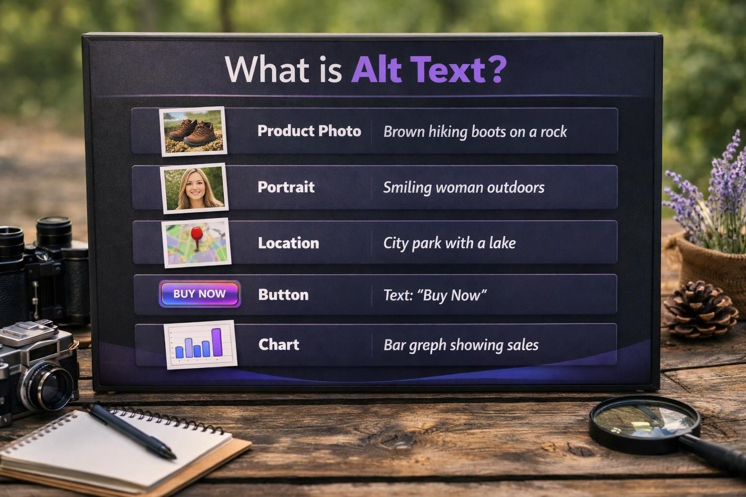
Alt Text Examples by Image Type
Alt text should match the image’s job. Informative images explain content; functional images help users act. The same photo may need different alt depending on whether it’s a hero, a tutorial step, or a link. Ask: what’s lost if the image disappears, and what should the user do next?
To keep quality consistent, spot-check key templates or run an alt text checker during audits. For standards, see helpful writing guides.
Products, People, and Places (Photos)
For product photos, name the product and the buyer-relevant detail for this context. Examples:
- “Black leather ankle boots with side zipper, pair angled left”.
- “Stainless steel water bottle with flip straw lid, 24 oz”.
- “Close-up of laptop keyboard showing backlit keys”.
For people and places, mention identity only when it matters; otherwise describe the meaningful action or scene:
- “Chef plating pasta at a restaurant pass”.
- “Team meeting in a conference room with whiteboard notes”.
- “Sunset over a mountain lake with pine trees in foreground
Buttons, Icons, and Linked Images (Functional)
Functional images should describe the action, not the appearance, because users are trying to navigate. Examples:
- Button icon: “Search”
- Linked image: “View cart”
- Social icon link: “Visit our Instagram profile”
- Arrow icon that expands a panel: “Expand details”
If the icon sits next to visible text that already labels the action (for example, a magnifying glass beside the word “Search”), the icon may be decorative and can often use empty alt. The goal is to prevent screen readers from announcing “magnifying glass icon” when the user really needs the control name. When in doubt, test with keyboard navigation and a screen reader to confirm the control is announced once, clearly.
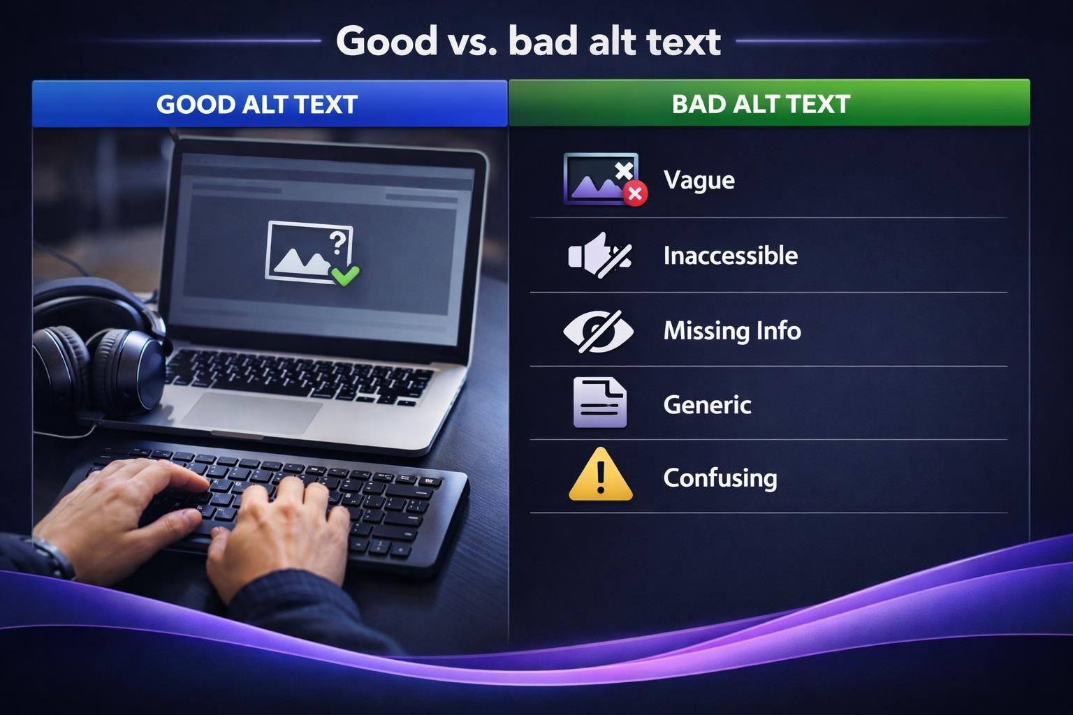
Good Vs. Bad Alt Text Examples (Quick Fixes)
Good alt text is specific, contextual, and non-repetitive. Bad alt text is vague, keyword-stuffed, or just repeats nearby copy. Quick fix: remove filler, delete marketing language, and swap generic words for concrete nouns plus one key detail.
Examples (bad to good):
- Bad: “image” | Good: “Two-factor authentication setup screen showing QR code option”.
- Bad: “Best running shoes cheap running shoes sale” | Good: “Blue running shoes with mesh upper and white sole”.
- Bad: “Company logo” (link home) | Good: “Go to homepage”.
- Bad: “Chart of revenue” | Good: “Line chart showing revenue rising steadily across the year”.
Need a start? Write what you’d say on a phone call, then trim. See more blog resources.
Special Cases: Decorative Images, Logos, and Images With Text
Decorative images add no information (flourishes, dividers, background mood). For these, the best experience is usually silence, not narration, so use empty alt when appropriate.
Logos depend on function. If a logo is pure branding and not a link, the brand name can be acceptable, but avoid repeating it so often that it becomes noise. If the logo links home, treat it as functional and describe the destination.
For images with text, include the essential wording users must know. Do not hide critical instructions, codes, or requirements in images without an equivalent text alternative.
When to Use Empty Alt (Alt=””)
Use empty alt (alt=””) when the image is decorative, redundant, or already fully described by adjacent text, as discussed in Alt Text for Decorative Images: When to Leave It Empty, so screen readers can skip it. Common candidates include purely stylistic icons next to labeled buttons, background textures, and repeated illustrations that do not add new information. Do not use empty alt for informative images, linked images, or anything that conveys meaning, because that would remove information from non-visual users. When unsure, ask: if the image disappears, would any user lose content or functionality?
Charts, Graphs, and Complex Images (What to Write Instead of Stuffing)
For charts, graphs, and diagrams, write a takeaway, not every data point. Good alt names the chart type and states the main insight, then points users to nearby supporting text, a table, or a longer description. This keeps alt readable while preserving access to details.
Examples:
- “Bar chart comparing support tickets by category; billing is highest, followed by login issues”.
- “Flowchart showing onboarding steps from account creation to first project launch”.
- “Diagram of a plant cell labeling nucleus, membrane, and chloroplasts”.
If labels are dense, recreate the content as structured HTML and test with a screen reader.
Common Alt Text Mistakes to Avoid
The worst mistakes either add noise or remove meaning. Keyword stuffing makes alt text harder to understand and can look manipulative, hurting relevance. Redundant alt text repeats a caption, heading, or nearby sentence, forcing screen reader users to hear the same information twice.
Avoid:
- File names like “IMG_4829.jpg”.
- Starting with “Image of…” every time.
- Missing the point while listing irrelevant details.
- Reusing the same alt across different photos.
- Mixing up title attributes and alt text.
- Ignoring functional intent on linked images.
QA tip: tab through key pages and confirm controls and images make sense. Add alt checks to your editorial checklist and sitewide writing workflow to prevent regressions.
How to Add Alt Text in Popular Platforms
Most tools include an “Alt text” field, but placement varies by component. In a CMS, you may set alt text in the media library or per image block. Use per-instance alt when the same image appears in different contexts.
On social media, add alt text during posting or editing, especially when the image carries meaning beyond a short caption.
In documents and slides, attach alt text to each image in object settings so it travels with the file. Workflow tip: write alt when selecting the image, not at the end, while intent is fresh.
WordPress, Social Media, and Documents
In WordPress, add alt text in the Media Library for the file, or edit it per image block within a post to improve your WordPress image SEO. Use per-block alt when context changes. On social platforms, look for “Accessibility” or “Alt text” during posting and keep it concise.
In Microsoft Word and PowerPoint, open the picture’s format/accessibility options and enter alt text. Run the built-in accessibility checker to catch missing alt and obvious problems. Create a simple contributor template for high-volume publishing.
Conclusion
Writing good alternative text is less about perfect phrasing and more about matching the image’s purpose to the user’s needs in that moment. Use a simple formula, describe actions for functional images, keep decorative visuals silent with empty alt (alt=””), and summarize charts instead of cramming in data. When you need to move fast, keep a small library of alt text examples and adapt them to your webpage context, then do a quick spot-check with a screen reader using our guide on how to write alt text. Done consistently, alt text examples become a practical habit that improves accessibility and supports image search without extra complexity.